South Dakota artist Dick Termes has some civic art in mind: he wants to redesign our state flag.
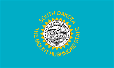
Right now, South Dakota flies this wholly unsatisfying banner:
What's wrong with this flag?
- Words don't belong on a flag. The flag should be an effective symbol in itself, with no need of a verbal caption.
- In almost any representation, the state seal centered on the flag is meaninglessly small and overly detailed. You can't make out the details in the above image. You can't make them out when you see the flag flapping above the State Capitol Building or a parade float.
- Even if you could make out the details in the seal (steamboat? horse-drawn plow? fertile fields? are we that stuck in the 19th century?), these images pose the same problem as the words: they are explicit rather than powerfully symbolic. Consider: the American flag doesn't show a bleeding soldier; it shows bold red stripes that symbolize the blood of patriots shed for freedom.
What does Termes propose instead?
Something that's seen from a distance that shows up in the air. You know I mean we know what the background of a flag is so you have to have the colors work so that you get a nice white background behind it so that it's going to pop and so that it looks neater than all the other 50 flags so I mean why not have a flag that's the best and most fun to look at flag [Dick Termes, quoted by Charles Michael Ray, "Dick Termes Proposes a New State Flag," SDPB, 2011.01.15].
Nice bright sun, good colors (especially if you're an SDSU alum!), and a big medicine wheel in the middle to bridge cultures and represent all South Dakotans. Hmmm... perhaps replacing our black-and-white Manifest Destiny symbology with a symbolic acknowledgment of our Native American brothers and sisters would be an appropriate gesture to mark the transition from former Governor Mike Rounds's relatively quiet "Year of Unity" to a term of clear, visible action by our new governor on Native American issues.
Termes says he's not so much interested in promoting his specific design as he is in stimulating a public dialogue about improving the design of our flag. So have at it, fellow South Dakotans! Break out your crayons and markers, and sketch up what you'd like to run up the South Dakota flagpole.


Termes is spot on with the flag design, and yes, the dialogue would be great to have too.
Actually, little known fact, Dick and I wear the same olive green hat, which he buys in the dozens. I saw him this past yr, with both us wearning that darn hat, and needless to say, a friendship was struck somewhere over the Missouri river as he threw quarters over the edge of the bridge.
I like his design idea. More important, I like the idea of redesigning our state flag, to make it unique and instantly recognizable. For example, New Mexico doesn't have my favorite design of all the flags, but when you see it, you instantly know it's New Mexico. It's a simple graphic that doesn't look like any of the others.
Regardless of design, replacing the words and tiny, overly detailed seal are good ideas. In addition to being hard to read from a distance, yellow words on a blue background are virtually impossible to read. (The only way they could make it harder to read would be to use red on blue or red on green.)
As an artist, I would very much like to see a dialogue especially amongst the very talented artists we have in our state. I agree with the previous comments and if I might suggest a collaborative between Termes, and others along with the Native American artists that we are so fortunate to have living and working here.
Cory,
I think we should stick with the current background colors of sky blue and maybe super impose the actual iconic faces of Mount Rushmore over the center, removing "The Mount Rushmore" state words, while keeping the "South Dakota" name in gold letters above the icon. Just a suggestion. . .
I really like what you said and i think that it should stay the way that it is and take off the words and then also make the symbol design a little bit bigger.
I agree that our flag isn't the best. It is hard to see all of the detail from far away. I also thing that words aren't the best thing for a state flag. Maybe if it just said South Dakota or the year, but not anything else. Termes design is much more logical than the other one in my opinion.
I really think it would be a neat idea to resign the old flag and come in with a new and more catchy flag. The reasons to not like the old ones are good stated reasons, for one when people look at a flag it should not have words to explain the situation or in any way have words on it. It would be really fun to see a new flag us.
I like the idea, and I think it would be neat to design a new flag and make it look like that! I think that our flag is kinda dull and it would be cool to have a new upgrade. I also like the idea of the dialogue.
I really think that the flag should stay the same with the background colors and maybe change the middle to something else. But great idea it would be interesting to see the flag change.
I like the idea and I think change would be nice, although both designs resemble each other. I also think that the state seal in the center of the flag is overly detailed and too small to even see what is on it. I like that the colors of blue and gold are on the new design because I think the two colors look good together!
I like the idea of the flag changing. Seeing this new design idea and hearing the meaning really seems like a really good change. Hearing the supporting details and points that you made only makes the change better.
I really think that making a new flag would be a great idea. The flag we have now is really hard to read and you can't see the seal in the middle.
I also agree with you, I think South Dakota does need a new flag design. We could make a design that would make us stand out more and be more unique. It would be interesting what some people would come up with if they drew their own design of what they think should and shouldn't go on our state flag.
Good comments all! Note what Brandi catches: Termes's design still reflects the current design, sunshine in the center (harkening to our old nickname, the Sunshine State, which we replaced with the Mount Rushmore State). I wonder... would anyone like an even bigger change, maybe colored bars like the Texas flag or the French tri-color? What colors do we want representing our state? What would those colors mean?
This is not an issue worth wasting time on. Flags divide people pointlessly. The world is changing. If you think of yourself as first a member of some small group you will be left behind.
We must think of ourselves as global citizens now.
Why do we need an official state flag? What's the point?
A flag is pure ceremony, window dressing, whether we're talking state, country, any institution. The question of whether we need a symbol to stand for our institution is a whole separate question from whether a particular symbol is well-designed. I agree that I wouldn't want the Legislature spending a lot of time on this issue (or any other) when there's still a budget to craft. But if some artists and other citizens would like to propose some ideas to improve the flag and the Legislature would take a few minutes to approve it, I wouldn't mind.
I have a suggestion. It's posted at http://decorumforum.blogspot.com/